
How to adapt a website for people with disabilities
Website accessibility is not just a technical requirement or an extra feature. It is a necessary condition for information and services to be accessible to all residents, including people with visual, hearing, mobility, speech or cognitive difficulties. In the public sector in the EU, this is especially important, because municipality, school, library, museum and other organisation websites are often the main source of information for residents.
An accessible website helps not only people with disabilities. Clear structure, understandable language, convenient navigation and good contrast are useful for all visitors, especially older people, mobile device users or those visiting the website in a hurry. In addition, public bodies need to ensure compliance with accessibility requirements, GDPR principles and good digital service practice.
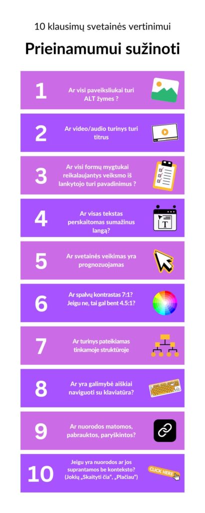
10 questions for assessing website accessibility
- Do all images have ALT tags?
Alternative text helps people using screen readers understand what is shown in a photo or illustration. If a municipality website publishes an invitation to an event and important information is presented in a poster as an image, the ALT description should convey the essence and not be left blank.
For decorative images, ALT text may not be needed, but for informative images it is essential. This is especially relevant for schools, museums and libraries, which often publish visual content about events, exhibitions or educational activities.
- Does video and audio content have subtitles or text alternatives?
Videos should have subtitles, and audio recordings should have text summaries or transcripts. This helps people with hearing disabilities, as well as those who view content in a public place or without sound.
If a museum publishes a virtual tour and a school publishes a video message from the principal, it is important to ensure that the main information is available without sound as well. In this way, the content becomes understandable to a wider audience.
- Do all form fields and buttons have clear labels?
Registration, application, contact or survey forms must be clearly labelled. The visitor should understand what needs to be entered in each field and what a specific button will do, for example, “Send application” or “Register for event”.
On public-sector websites, forms often collect personal data, so it is important not only to be clear, but also to comply with GDPR. Information should be provided on why the data is collected, how long it is stored and how to contact the organisation about data processing questions.
- Does the text remain readable when the window is reduced or enlarged?
The website must be convenient to use on different screens and browser zoom levels. If text overlaps, buttons disappear or horizontal scrolling appears, the content becomes difficult to access for some visitors.
This is especially important for older people, who often enlarge text, and for mobile device users. On municipality and school websites, the most important information must be easy to read without additional obstacles.
- Is the website behaviour predictable?
The user should understand what will happen after clicking a link or button. If menu items behave differently, pages unexpectedly open in a new window or a form automatically redirects the visitor elsewhere, this can cause confusion.
Predictability is especially important for people with cognitive difficulties, as well as for anyone who uses a website infrequently. On library or museum websites, a clear and consistent structure helps users find the events calendar, opening hours or ticket information more quickly.
- Is the colour contrast sufficient?
The text should stand out clearly from the background so that it is easy to read. Letters that are too light on a white background or weak contrast in menu items make the website harder to use for people with visual impairments.
Contrast is important not only for the main text, but also for buttons, links and form error messages. If, for example, a registration error is marked only in red, some users may not notice it, so it is worth adding a clear text explanation as well.
- Is the content presented in a suitable structure?
Headings must be logical, consistent and help users understand the page content. A proper structure is important not only visually, but also for assistive technologies that allow quick navigation through page sections.
For example, a school website should clearly separate sections about admission, education programmes, news and contacts. When content is arranged neatly, visitors find information more quickly, and screen reader users can navigate more comfortably.
- Can the website be used clearly with only a keyboard?
Some users cannot use a mouse, so all important functionality must be accessible by keyboard. This means that menus, links, forms and buttons must be accessible using the tab key, and the active element must be clearly visible.
If a public services page on a municipality website cannot be reached without a mouse, that service becomes inaccessible to some residents. Keyboard navigation is one of the essential accessibility checks.
- Are links clearly visible?
Links should not be recognisable by colour alone. It is best when they are underlined or otherwise clearly distinguished so that the user immediately understands where they can click.
This is especially important on longer information pages, for example when a library publishes usage rules or a school presents admission procedures. Clearly visible links help users find related documents, forms or contacts more quickly.
- Are link texts understandable without additional context?
The link text should clearly say where the user will go. Instead of generic phrases such as “Click here”, it is better to use specific names, for example, “View admission rules” or “Download application form PDF”.
This helps not only screen reader users, who often review just the list of links, but all visitors. Clear links reduce confusion and make it faster to complete the required action.
What else is worth assessing?
Accessibility is not a one-off task. Every time a website is updated, a new document is uploaded or a registration form is created, it is important to check whether the changes remain convenient for all users. A common problem in the public sector is uploaded scanned PDF documents that screen readers cannot read. Therefore, documents should also be prepared accessibly.
It is also worth ensuring clear language. Even a technically sound website will be difficult to use if it contains many complex, bureaucratic formulations. On municipality, school, museum and library websites, information should be presented clearly, in short sentences, with actions, deadlines and responsible contacts stated plainly.
An accessible website shows respect for every visitor. It helps public bodies provide better digital services, reduce exclusion and ensure that important information is accessible to everyone without exception.